Shutterstock
In December 2016, a pharmacist in Antrim, Northern Ireland, was prosecuted for dispensing propranolol instead of prednisolone to a patient who later died — the same error that led to the conviction of a locum pharmacist in England seven years earlier. The pharmacist involved in this latest incident told police the products were next to each other on the shelf and had similar branding.
Just one month later, in January 2017, a study into medication errors in children flagged up that confusion over medicines with similar names, packaging or branding contributes to dispensing errors in community pharmacy across England and Wales.
Both events highlight the importance of packaging design in the safe use of medicines.
“[Packaging design] is a factor in a big proportion of the medicines errors we see. Stuff that starts with the same letter, then the packaging also looks the same, that has a big impact,” says Leyla Hannbeck, chief pharmacist at the National Pharmacy Association (NPA), the trade association for independent community pharmacy in the UK.

Source: Courtesy of Leyla Hannbeck
Leyla Hannbeck, chief pharmacist at the National Pharmacy Association, says that packaging design is a factor in a big proportion of the medicines errors reported to the organisation
It is a decade since the National Patient Safety Agency (NPSA), to much fanfare, produced a guide for the design of medicines packaging in a bid to reduce the risk of dispensing errors[1]
. Manufacturers were provided with a clear and comprehensive checklist outlining the key factors in packaging design that could impact patient safety. Recommendations were made on text size, type, spacing, placement and readability, as well as the use of colour to help distinguish between products.
However, ten years later, how much of that advice has been adopted and how far has packaging design come in making the dispensing process safer?
Some manufacturers have started to look at how to improve things, but the problem still exists
“Some manufacturers have started to look at how to improve things, but the problem still exists,” says Hannbeck, who acts as the medication safety officer for all independent pharmacies in England with fewer than 50 branches.
In her most recent quarterly review for January 2017 to March 2017, Hannbeck found that 189 of 300 medication errors (63%) involved medicines with similar looking or sounding names[2]
. Common examples reported to the NPA included mixing up allopurinol and atenolol, or enalapril and escitalopram.
Sharing information
A significant part of the NPA’s work in minimising dispensing errors is making its members aware of products that sound and look alike, and subsequently cause the most frequent problems.
“We have a list of products with similar looking packaging that we review on a regular basis. We advise our members to do everything they can to separate these products from each other,” says Hannbeck.
Community pharmacy safety officers meet monthly to share learning across different organisations, particularly where medication errors seem to be happening frequently or have caused significant harm.
At these meetings, a ‘drug of the month’ is highlighted to illustrate a particular issue. In November 2016, the potential to mix up bipolar treatment quetiapine and quinine was highlighted (see figure 1), a mistake that can have serious repercussions. Pharmacists are now advised to store quetiapine under ‘Z’ in the dispensary to avoid confusion.
Mix-ups between eye and ear drops is another common problem. In 2015, data collected by community pharmacy representative body Pharmacy Voice, which has since disbanded, showed around 100 mix-ups a year were happening in England between chloramphenicol ear and eye drops. Both products were typically co-located in the fridge, in boxes and bottles which were identical in size, shape and colour, with similar text.
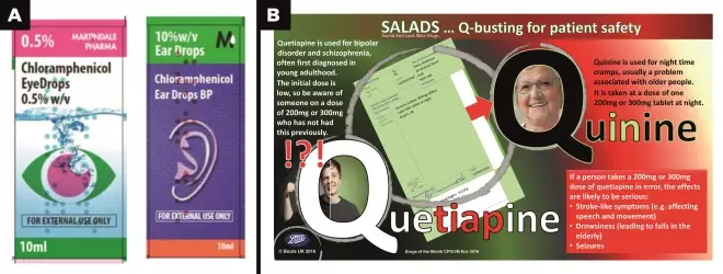
Figure 1: Revised chloramphenicol packaging and Boots safety leaflet
A. Data collected by Pharmacy Voice on mix-ups between chloramphenicol ear and eye drops led the manufacturer to make simple design changes to help distinguish between the two formulations
B. The potential to mix up bipolar treatment quetiapine and quinine was highlighted to pharmacists in November 2016 following a meeting of community pharmacy safety officers
Although this error doesn’t tend to cause serious harm, “if you are a small child and you have a ten times stronger dose of ear drops in your eye, it definitely causes distress,” says Kate Livesey, former senior policy and programmes adviser at Pharmacy Voice.
The Medicines and Healthcare products Regulatory Agency (MHRA), which regulates medicines and medical devices in the UK, was able to use the evidence collected by Pharmacy Voice to work with the manufacturer Martindale Pharma to make simple design changes. As a result, the ear packaging now features a large symbol of an ear and is navy blue instead of white (see figure 1).
“[This case] is a good example of if we have the right evidence and we are working with the right people, we can get things changed,” Livesey adds.
The MHRA says that it regularly reviews the packaging of medicines that have been involved in a medication error and considers whether changes to the packaging within the regulatory framework could help reduce the likelihood of error.
“Key issues on which we might consider seeking changes relate to similarity of packaging and look-alike or sound-alike names,” explains Jan MacDonald, group manager responsible for access and information for medicines and standards at the MHRA.
“If picking errors occurred, we would work with healthcare professionals to understand how such errors happened and whether any changes to the pack design could reduce the likelihood of risk before approaching the marketing authorisation holder to seek their agreement to introduce changes to improve patient safety,” she adds.
However, although it can offer advice, MacDonald points out that as long as companies comply with a 2001 EC directive on labelling[3]
, the MHRA cannot refuse to authorise packaging artwork.
“The legislative framework does not regulate the way in which the information items are placed on the pack and is silent on the issue of pack design,” she says.
The legislative framework does not regulate the way in which the information items are placed on the pack and is silent on the issue of pack design
But the MHRA does issue guidance and consulted on its ‘Best practice guidance on the labelling and packaging of medicines’ in April 2017[4]
. The regulator asked stakeholders, including pharmacy organisations, whether its guidance continues to represent best practice and requested examples of medication errors that have resulted from issues with packaging. The MHRA plans to discuss the outcome of this consultation with industry trade associations to see what changes may be needed.
The best practice guidance cites one example where the regulator was able to specify a design change: in 2009, tall man lettering was introduced for generic cephalosporins following research by the NPSA. Capital letters are used to pick out the middle section of the name to help differentiate between medicines and help dispensing, for example, cefADROxil, ceFIXime and cefRADine. This approach has been around for some time in the United States, where the Food and Drug Administration launched its name differentiation project in 2001 and now has 19 pairs of ‘sound-alike/look-alike’ drug names for which manufacturers are requested to use tall man lettering. Similar national schemes have been in place in Australia since 2011 and New Zealand since 2013.
The NPA passes on any problems highlighted by its reporting system to both the MHRA and to drug manufacturers. But changes take time, says Hannbeck.
“In an ideal world, I would want manufacturers to make every attempt to make these products completely dissimilar to each other,” she says. “I understand it is a tricky process and it costs money but it is about patient safety.”
Manufacturers’ view
Branded drug manufacturers say they take dispensing safety into account as part of the general process of making medicines easy to use. Brendan Marken, vice president of new product transfer and technical packaging at GSK, says patient safety informs everything from concept development to the end user and “is part of our overall approach to helping make sure that our medicine packaging, information and design is developed to be accessible and resistant to inadvertent or accidental use”.
Similarly, a spokesperson for AstraZeneca says that the company looks at colours and branding on packaging for similar products from competitors when it looks at designing its own packaging, and will always look to differentiate its products from other medicines in the same therapeutic area.
Paul Fleming, technical director of the British Generic Manufacturers Association, argues that packaging design and its impact on safety and usability, both for the pharmacist and the patient, is taken seriously by generics manufacturers.

Source: Courtesy of Paul Fleming
Paul Fleming, technical director of the British Generic Manufacturers Association, says there is variation in how much companies are investing in packaging design
“We have regular best practice workshops where we share design portfolios, learning and feedback and we do that in a very open way,” he says, adding that the organisation also meets with the MHRA to discuss best practice.
“This is not a one-off exercise, we do this about once a year. Companies have to think about not just their own portfolio but also other generics that could be on the shelf at the same time.”
Companies have to think about not just their own portfolio but also other generics that could be on the shelf at the same time
Fleming also points out that overhauling a drug’s packaging design is, with all the best intentions, not a quick process. For the redesign of a whole portfolio, for example, a company might look to do that every five years, or perhaps if there is a merger. Individual product design may be refreshed on a more regular basis, he says, but there are limits. “For example, the name itself — there is no choice over what to call the product,” he says.
Of course, cost can be a barrier to how far you can go on pack design. Fleming admits there is variation in how much companies are investing. “Companies that have done the most in terms of research and user testing have very large portfolios or a particular number of critical medicines,” he says.
One thing that has changed since the NPSA report came out, he believes, is the growth of companies carrying out ‘real life’, end-to-end user testing. This means looking at what happens to the product from it leaving the warehouse to arriving in a patient’s home.
“In that they [the companies] would look at the actual dispensing process — how that product is picked off the shelf.”
The other major change is a shift in focus away from brand identify to the product’s key identifying information, says Fleming.
“[Pack design] has changed over time and now it is much more strongly focused on making sure the name of the product is as prominent as it can be.”
Pack design has changed over time and now it is much more strongly focused on making sure the name of the product is as prominent as it can be
One of the generics brands to have included safety of dispensing in the overall design of its range is Teva — the biggest generics supplier to the NHS.
After a name change at the end of 2004, the company — headquartered in Petah Tikva, Israel — came up with its 360 packaging range, which was designed to reduce confusion over different medicines, and different strengths of the same medicine.
Bruno Barcelos, senior director of generics at Teva, explains that the company consulted with patients and health professionals at every stage, testing prototypes as it went.
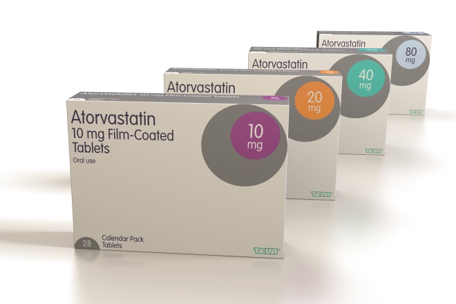
Source: Courtesy of Teva
Generics manufacturer Teva redesigned its packaging in 2005 to reduce confusion over different medicines, and different strengths of the same medicine
The result is a clear typeface in dark blue-on-white for easy reading, with colour-coded circles chosen so that multiple prescriptions for same therapy areas are clearly distinguishable. It has been designed with the aim that products that are commonly prescribed together are not in similar colours. Colour-coding is also used to aid product checks in transit boxes.
“On the occasions when pharmacists and patients have flagged where some medicines featured similar colours, or there had been a near-miss, we revisited the original design principles and made changes, including moving some medicines into different coloured packs,” he says.
“As our range has grown since 2005, we have also added more colours to the palette. We are currently looking at more enhancements to the style to make it even more future-proof.”
Design principles
However, guidance from the European Medicines Agency (EMA), which evaluates medicinal products for use in Europe, highlights drawbacks with using colour-coding, not least the options available — what if a company has 600 products? Also, with no standard convention for colour-coding, this may not necessarily make picking safer.
Brian Parkinson from Making Sense, a Sheffield-based company that specialises in healthcare design, agrees, saying that although packs should be visually distinct from others to reduce errors both in the pharmacy and in patients’ homes, there is only so much manufacturers can do. “However much effort a company puts into making sure their packs are all different — usually with colours or illustrations — their products will still be in an environment where pharmacists source generic medicines from wherever is cheapest, and where they have no control over pack design.”
All a manufacturer can do is make sure key identifying information is as clear and obvious as possible, he advises. “[The design] needs to clearly present the information necessary for it to be used safely — its name, strength, route of administration, expiry date, warnings and dose instructions,” he says.
The EMA says there are legal requirements as to what information must appear on the outer packaging, including the name, dose, and route or method of administration. The EMA updated its guidance on reducing the risk of medication errors in 2014 after a series of workshops attended by academics, regulators and drug companies[5]
. And when it comes to design of packaging, the guidance says companies should consider the potential for confusion with other medicines in the design process.
The EMA works with companies at an early stage to identify where problems may occur. “Quite often when companies launch completely new designs, they come to us to ask advice,” says Alexios Skarlatos, head of labelling review and standards at the EMA.

Source: Courtesy of Alexios Skarlatos
Alexios Skarlatos, head of labelling review and standards at the European Medicines Agency (EMA), believes there has been a lot of progress in applying the principles of good design developed by regulators over the past ten years
Skarlatos believes there has been a lot of progress in applying the principles of good design developed by regulators in terms of both pack design and displaying of information over the past ten years.
“We also have to recognise the constraints, certain legal requirements for information in different countries — for example in Belgium the information has to be in three languages. But we do interact with companies to try and find the optimal solution.”
The EMA does not, however, provide companies with specific examples of good design because of concerns this would hinder creativity and innovation, and the process would instead become a ‘copy and paste’ exercise.
Other factors at play
Despite clear guidance on packaging design, it is inevitable that some packs can look similar when you look at an entire dispensary, says Victoria Steele, head of clinical governance and professional standards at Celesio UK, parent company to Lloydspharmacy and wholesaler AAH.

Source: Celesio UK
Victoria Steele, head of clinical governance and professional standards at Celesio UK, says that if an error involves similar looking packs or names, there can be a tendency to attribute the incident to the pack rather than digging deeper to consider all contributory factors
With that in mind, aspects such as tall man lettering and consistent colouring for high-risk medicines can be very useful, she says. “Seeking products from different manufacturers can have an impact too,” adds Livesey. “This is something we discussed recently for prednisolone and propranolol as the different portfolios offer different packaging styles.”
But there are many other factors involved in dispensing errors that have nothing to do with a medicine’s pack design or name, such as telephone calls and distractions from colleagues or patients. In the case of the pharmacist in Northern Ireland, cramped working conditions, tiredness, and an inadequate standard operating procedure were all thought to contribute to the tragic dispensing error.
“If an error involves similar looking packs or names, there can be a tendency to attribute the incident to the pack rather than digging deeper to consider all contributory factors,” says Steele.
If an error involves similar-looking packs or names, there can be a tendency to attribute the incident to the pack rather than digging deeper to consider all contributory factors
Livesey agrees, saying that, although names and packaging are important, “through root cause analysis, pharmacy teams generally find that it is often another reason, or a combination of reasons, that has caused an incident to occur rather than due to the similar packaging or names alone”.
And, in the NPA’s latest quarterly report, ‘work and environment’ was cited as a main contributing factor in 40% of errors[2]
.
Lloydspharmacy has introduced a SaferCare process to properly investigate when mistakes are made. “Packaging can be an easy target. SaferCare requires pharmacy teams to delve deeper to establish the root cause — or causes — and facilitates coming up with solutions to prevent similar future incidents,” says Steele.
Livesey believes that it is not as simple as asking manufacturers to do more. “Generally, we’ve found that any manufacturers we’ve engaged with are incredibly pleased and want to work with pharmacy to make their packaging as safe as possible. In reality it is probably a collaborative approach that is needed across industries.”
References
[1] National Patient Safety Agency and Helen Hamlyn Research Centre. Design for patient safety: a guide to the graphic design of medication packaging. 2nd edition; 2007. Available at: http://www.nrls.npsa.nhs.uk/EasySiteWeb/getresource.axd?AssetID=63052 (accessed May 2017)
[2] National Pharmacy Association. Patient safety quarterly report: Quarter 1 (January–March) 2017. Available at: https://www.npa.co.uk/wp-content/uploads/2017/04/MSO-2017-Q1-report-final-2.pdf?utm_source=Communicator&utm_medium=Email&utm_content=Untitled1&utm_campaign=Patient+Safety+Report-27-4-17+%5bTEST%5d (accessed May 2017)
[3] Directive 2001/83/EC of the European Parliament and of the Council of 6 November 2001 on the community code relating to medicinal products for human use. Available at: http://www.ema.europa.eu/docs/en_GB/document_library/Regulatory_and_procedural_guideline/2009/10/WC500004481.pdf (accessed May 2017)
[4] Medicines and Healthcare products Regulatory Agency. Best practice guidance on the labelling and packaging of medicines. Available at: https://www.gov.uk/government/uploads/system/uploads/attachment_data/file/474366/Best_practice_guidance_labelling_and_packaging_of_medicines.pdf (accessed May 2017)
[5] European Medicines Agency. Good practice guide on risk minimisation and prevention of medication errors. November 2015. Available at: http://www.ema.europa.eu/docs/en_GB/document_library/Regulatory_and_procedural_guideline/2015/11/WC500196981.pdf (accessed May 2017)