Nadia Atturi
Not everyone will conduct groundbreaking research destined for publication in a prestigious journal that creates an opportunity to deliver presentations to the international masses. Nonetheless, the publication of smaller pieces of research and incremental improvements in care can be valuable. Such works need to be shared with others and a conference poster is often the ideal platform to do so.
Not only is this a less intimidating way to display the fruits of your labour, it also provides an opportunity for you to network with likeminded individuals from other organisations and have one-to-one discussions about your findings.
So what do you need to consider when constructing a research poster, and how can you best get your message across?
What you should display where
“Ideally, a poster should be used to communicate findings that others can benefit from,” says Kieran Hand, consultant pharmacist in anti-infectives at University Hospital Southampton NHS Foundation Trust. “Although many service evaluations and audits could be presented, the medium is best used to present new evidence that helps or inspires others to improve the care of patients.”
Gillian Cavell, deputy director for pharmacy (medicines safety) at Kings College Hospital NHS Foundation Trust, believes you need to consider the audience when deciding the conference for which you want to submit a poster. “Some scientific research requires a lot of background knowledge for it to be understood, so it may not be suitable for a conference targeted at clinical pharmacists. If you want to present at a conference at which there are a wide range of practitioners, it would be best to present research that is quite generalisable and relevant to the majority of the audience.”
The right level of detail
Most conferences require an abstract of your research to be submitted before you are granted approval to present a poster. “A common mistake made is to duplicate text from the abstract in the poster,” says Cavell. “This isn’t necessary. I don’t need to read the abstract again — I will have already read it in the conference booklet.”
Hand agrees: “The abstract should communicate what has happened and allow people to determine if the findings are valid. The poster should act as an advertisement for the abstract. It needs to have visual impact.”
He also warns would-be poster designers not to include too much detail. “A balance needs to be struck. You need to include enough information for readers to understand if your method is robust but readers shouldn’t expect to be able to replicate your work just by reading your poster.”
Trudy Thomas, director of taught graduate studies at Medway School of Pharmacy, says: “You can only present a narrow strand of your work so choose carefully.” She adds: “You won’t be able to fit everything you want to say on to one page so you’ll need to be selective. Remember that what you present needs to be of interest to people and they need to understand it.”
Mette Heringa, research pharmacist for Dutch-based medicines safety organisation Health Base, won a poster competition at the 2014 International Pharmaceutical Federation (FIP) congress. She recommends: “A poster should be a starting point for discussion about the work you have done. Think about what people need to know rather than what you want to say about your research.”
How to design a research poster
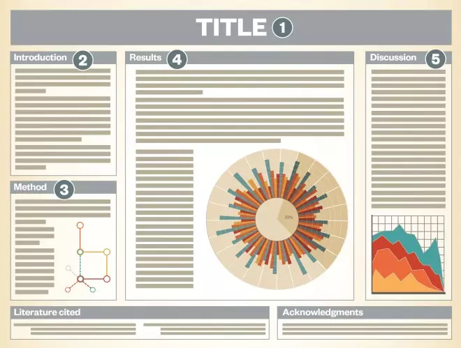
An overview of the main features to include when putting together a research poster for a conference to ensure you are showcasing your findings in the best possible way
1) Title: Make it as catchy as possible, but make sure it conveys the issue that you are trying to solve
2) Introduction: No need for a comprehensive literature search but do explain why it was necessary to do the research
3) Method: Make sure it includes what, when and how you did the research. Consider using a flow chart if this makes it clearer
4) Results: Use graphs, charts and tables wherever possible
5) Discussion: Are your results consistent with previous findings or are they new? (If new, how are they new?) Put your results into context by describing their implications and include the next steps for the research

Dos and don’ts of poster design
Do:
- Use pictures and graphs to convey your results;
- Acknowledge any limitations of the research;
- Put your research in context;
- Include a date and location of your research;
- Use a text size that can be read easily, and ensure the font and spacing are consistent throughout;
- Avoid jargon;
- Include accurate references and acknowledgements;
- Perform a spell check;
- Label your charts, graphs and tables.
Don’t:
- Cram in too much information;
- Design your poster without checking the dimensions of the conference poster board;
- Copy and paste your abstract on to the poster;
- Use low-resolution images.
Making your work stand out
A touch of creativity will go a long way in attracting other conference delegates to your poster. Cavell advises: “Make sure you use colours with plenty of contrast so that people can read what you’ve written. Colour can also be used to highlight the most important bits.
“Arrange your content logically and make it easy for people to navigate through your work. Consider using bullet points to convey short sentences and avoid large blocks of text. And make sure you use a text size that can be read at a distance.”
Thomas warns that the way a colour looks on a screen is not necessarily how it looks when it is printed. She suggests: “If you can, do a test run at quarter size to check how the poster looks on paper. Watch out for any minor misalignments of texts and tables. These may appear small on screen but will be a lot more obvious on an A0-sized poster.”
Hand points out that many hospital trusts have a template for poster presentations that the media department should be able to provide. The template at his hospital includes instructions on what size and type of font to use. If your employer does not have one, Hand advises: “Spend a bit of time personalising charts or tables and don’t just use Microsoft’s default colours.”
He also recommends using photographs, where appropriate and beneficial, to illustrate a component of your work because these are particularly eye-catching. Any images, however, should be high resolution or they may look unprofessional on the final poster.
Thomas advises pharmacists to seek technical help if it is available. “While you may be an expert in your field of study, you may not necessarily be an expert at poster design,” she says. “There’s no point in spending ages designing a poster if you know someone else who can do it better and faster.”
Charting your results
Using graphs and tables can be a useful way of communicating your results, Hand explains, but says “there’s no need to explain each one in detail in the text”.
Cavell adds: “Keep charts and graphs two-dimensional and organise them in a way so that any trends are easily identified. They should also be clearly labelled so that people don’t have to search for that information. I also find it beneficial to highlight the key results in a different colour to help them stand out.”
Tailoring to the audience
Can you expect to use a poster at several different conferences without changing its content to suit a different audience? Hand believes so: “It isn’t lazy to submit the same poster to several different conferences. The point of a poster is to disseminate your work so there is no need to make this too onerous.” However, some conferences prefer research presented to be unpublished elsewhere, so ensure you check this before submitting the same abstract to two different places.
Hand says it is important to avoid using jargon to help a wider audience understand the poster. Thomas agrees: “Get someone who has no idea what you’ve done to read it — and make sure they understand it.” She also advises that people read the rules of poster design for each conference before submitting — which will typically specify the maximum number of words a poster should contain and the size and orientation it should be.
Cavell suggests that, if you are submitting to more than one conference, it is more important to tailor the abstract than the poster.
On the day
Some basic preparation can help things go smoothly while presenting. “Look at your own work objectively and think about how you could respond to any criticisms people might have of your work,” says Hand. “Nobody expects research to be perfect and, as long as you are honest about and acknowledge any limitations, people will respect that.
“Also, given that many conferences have large numbers of posters, people will be grateful if a presenter can summarise theirs in just a few sentences. If asked to do this, don’t just start reading the poster word for word.”
Thomas offers practical advice: “Make sure you bring along the right accessories with which to hang your poster and something to carry your poster in. Any folding lines will make a poster look tatty.”
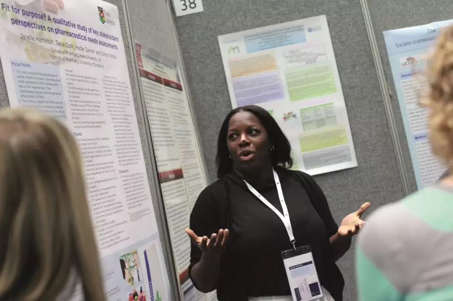
Heringa suggests that those who submit a poster to a conference must allocate time to showcase their work. “Don’t just put a poster up at the beginning of the conference and take it down at the end. Make sure you are standing by it during the breaks in the conference timetable so that you can have discussions with people who want to find out more.”
Cavell adds: “It’s always useful to take a stack of A4 printouts of your poster for others to take away, along with a copy of any data collection tool that you have found particularly beneficial. An open tin of chocolates will also help attract people to your poster. If you’re planning to use the poster as a networking opportunity, take along some business cards for people to take away.”


