Royal Pharmaceutical Society
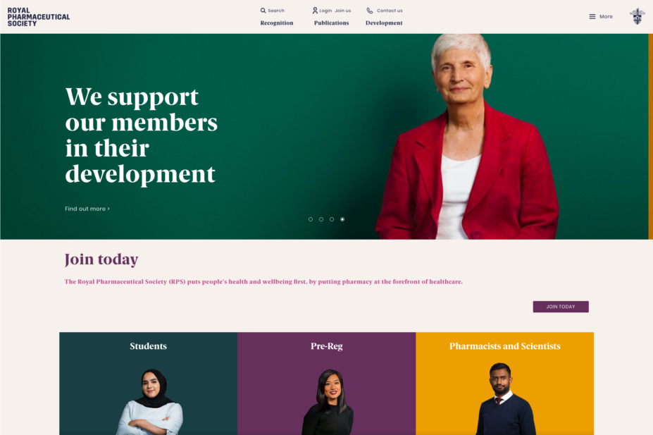
The Royal Pharmaceutical Society (RPS) website has been redesigned to make it easier to navigate and bring to the fore the Society’s work on its three major priorities: recognition for the pharmacy sector; career development for pharmacists; and the Society’s publications.
“People told us they loved the content on the website, but that it was hard to find, and that the best bits of RPS membership were hidden and it wasn’t always clear what we do for pharmacy” said Neal Patel, head of corporate communications at the RPS.
“The new site gives a clear view about what we do and how we do it. We’ve moved the good stuff to the top so it’s easier to find and navigate, and we have applied a consistent theme across the site that mirrors what we do best.”
Stuart Carter, digital content lead at the RPS, said that over the past six months his team had “pulled the website apart, boiled it down to its component parts, and then stuck it all back together as a lean, mean, membership machine”.
Carter extended his thanks to the “many, many people who helped us rebuild the site from the top down”.

