Shutterstock.com
Visualising data and tables can enable patterns, trends, outliers and correlations to be revealed, and comparisons to be made more easily. William Playfair’s first attempts at bringing line, bar and pie charts to mass audiences in the ‘Commercial and Political Atlas’ were published in 1786[1]
.
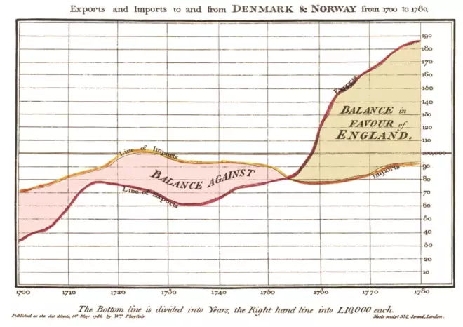
Figure 1: The Playfair graphic
Courtesy of Nigel Hawtin
William Playfair’s first attempts at bringing line, bar and pie charts to mass audiences in the ‘Commercial and Political Atlas’ were published in 1786
Since then, data visualisation has become an important aspect of research and academia. The ability to understand science often comes down to interpreting the data and following the story — and so storytelling within science communication is paramount. This is enhanced by the correct choice of data and type of graphic used, which is important not only to show the research, methods and results but also to engage readers across the wide range of media now available, including articles (both print and online), presentations, posters and social media.
If presented well, visuals are highly effective in conveying information and telling a story. If they are not presented well, they can misinform or hide the data, therefore confusing and turning the reader away.
The human brain starts processing visual cues within a tenth of a second[2]
so often an individual will have questions about an image before they have begun to pay conscious attention to it. These questions may include: Am I interested in this? How long will it take me to read? Are the visuals interesting? Do I like the colours used? Do I understand it? Do I want to understand it? Is it telling me a story that I can follow and am I willing to invest the time in looking at this?
With this in mind, the fundamentals of producing a poster or a presentation do not differ from one another in basic principles. Both must initially attract attention but then also ensure that they have a narrative and show the results and conclusions, while keeping the reader interested. It may be helpful to try to write one long sentence describing the gist of the story as a guide. The natural breaks can become the working titles for each image — this can be an effective way of planning a visual story. Knowing who your audience is or gauging who it might be, including its familiarity with the subject matter, can help in this process.
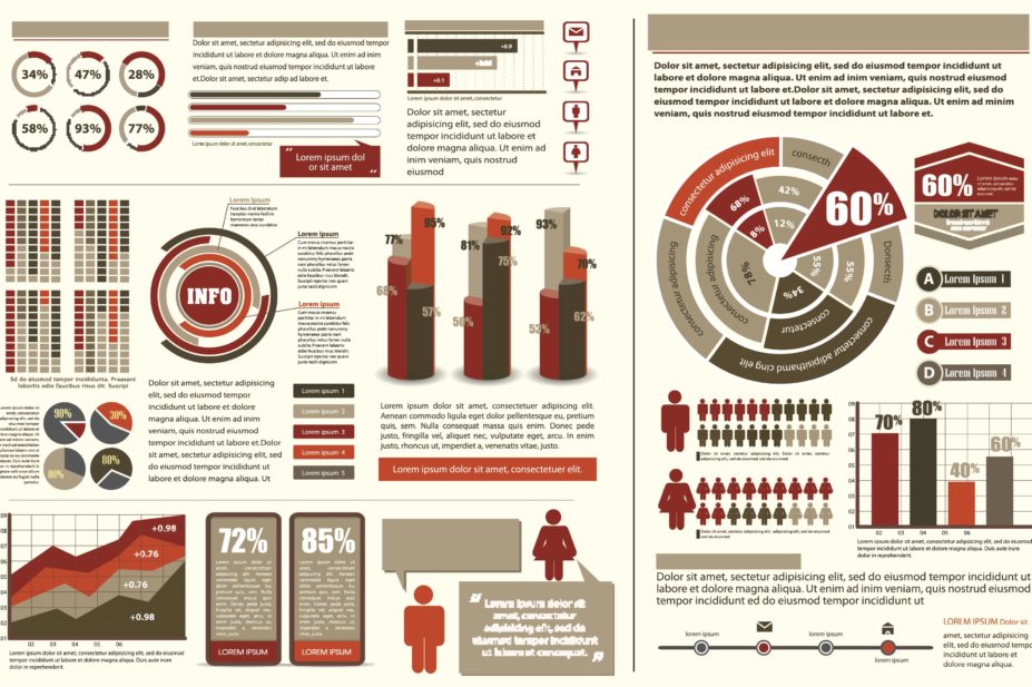
A poster is likely to be presented in a dynamic setting, where the audience may only spend a couple of seconds looking at it and deciding whether to invest more time in reading it and absorbing the information. The poster therefore needs to outline clearly what it is about using explanatory headlines and arresting and informative visuals.
Figure 2: Explanatory headlines and informative visuals
Courtesy of Nigel Hawtin
Clear headings and arresting visuals can help viewers decide whether to spend time absorbing information from a poster
A presentation is likely to be explained by the presenter as it progresses, so viewers can be guided through the slides. This means that information can be broken up on to several slides to explain the story or process better, because additional slides come at no extra cost. Five or six separate slides explaining a process or result is far better than one slide with everything on it.
Importance of data visualisation
This basic number grid makes it difficult to see how many number 3s there are.

Figure 3: Clarifying a basic number grid
Courtesy of Nigel Hawtin
Adding colour and editing the diagram in a simple way makes the position of the number 3s much clearer
However, just adding colour and editing makes this clear. This is a simple but effective way to show how colour and chart type (although this example is not a chart) can enhance data and tell a story.
Probably the most famous example of this is Anscombe’s quartet[3]
. This comprises four datasets that have near identical statistical properties. Constructed in 1973 by Francis Anscombe, it demonstrates the importance of graphing data before analysing it, as well as the effect of outliers on statistical properties.
| Anscombe’s quartet | |||||||
|---|---|---|---|---|---|---|---|
| I | II | III | IV | ||||
| x | y | x | y | x | y | x | y |
| 10.0 | 8.04 | 10.0 | 9.14 | 10.0 | 7.46 | 8.0 | 6.58 |
| 8.0 | 6.95 | 8.0 | 8.14 | 8.0 | 6.77 | 8.0 | 5.76 |
| 13.0 | 7.58 | 13.0 | 8.74 | 13.0 | 12.74 | 8.0 | 7.71 |
| 9.0 | 8.81 | 9.0 | 8.77 | 9.0 | 7.11 | 8.0 | 8.84 |
| 11.0 | 8.33 | 11.0 | 9.26 | 11.0 | 7.81 | 8.0 | 8.47 |
| 14.0 | 9.96 | 14.0 | 8.10 | 14.0 | 8.84 | 8.0 | 7.04 |
| 6.0 | 7.24 | 6.0 | 6.13 | 6.0 | 6.08 | 8.0 | 5.25 |
| 4.0 | 4.26 | 4.0 | 3.10 | 4.0 | 5.39 | 19.0 | 12.50 |
| 12.0 | 10.84 | 12.0 | 9.13 | 12.0 | 8.15 | 8.0 | 5.56 |
| 7.0 | 4.82 | 7.0 | 7.26 | 7.0 | 6.42 | 8.0 | 7.91 |
| 5.0 | 5.68 | 5.0 | 4.74 | 5.0 | 5.73 | 8.0 | 6.89 |
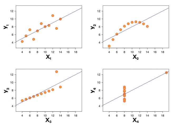
Figure 4: Anscombe’s quartet
Courtesy of Nigel Hawtin
Anscombe’s quartet demonstrates how important it is to visualise data before analysing it. The patterns in the data are more obvious from the graphs than from the table of numbers
This is still used today to illustrate the importance of looking at a set of data graphically before analysis.
Editing the data and the graphic
The editing process is vital and can make or break the visual understanding. There may be hundreds or even thousands of data but it may not be necessary to show them all. It is only important to show the whole data set if it helps the viewer to understand the story. Otherwise, it may be preferable to highlight a selection of data or even just one result to demonstrate a point. For example, line graphs that include every line and data point could be redesigned by using an aggregated line or by highlighting the most important lines as focal points, then greying out the remaining lines. This is dependent on the data and the format of the image used — it is important not to cherry pick the data or mislead the audience.
It is also important to consider the type of graphic used — for example, is a bar chart, line graph, histogram or scatterplot sufficient, or is a more complex graphical representation required? Bar graphs can be useful for comparing values, slope graphs are better for analysing trends, and column or line graphs can be used for either. Stacked bar or column graphs work well for examining the composition of data — a pie or donut chart can also be used for this as long as there are no more than a few segments. Scatter plots, bar charts, bubble plots and heatmaps are useful for investigating relationships or the distribution of data.
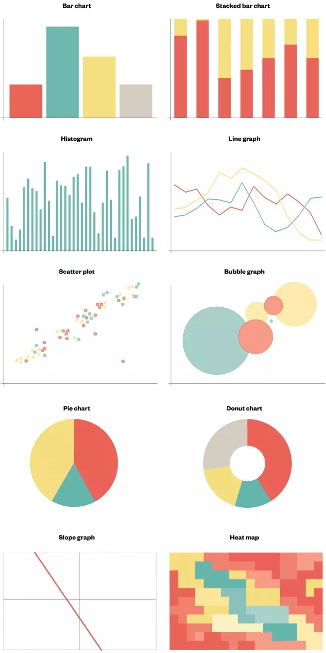
Figure 5: Different types of graphics
Different types of graphs can be useful for representing different types and complexities of data
There are many ways of displaying the same data, some better than others, so it is important to consider what the chart is trying to show and which format works best for that. Additionally, a more general audience may be familiar with reading simple charts whereas experts might be used to more complex types of visualisations.
The colour palette used can also make a big difference. The correct palette can help guide viewers through the story and organise the graphics, reinforce the topic and provide clarity, insight and context. Colour can grab attention and can signal where to look but it should be used sparingly so it does not confuse the audience.
Colour can also be used in a quantitative way and can carry tone and meaning. For example, using one colour and tints of that colour sequentially, accenting the highest value as a dark shade and the lowest value as a light shade (or vice versa), can portray a range of data effectively. Using an incorrect palette can hide or mislead, create a barrier to understanding or even convey the wrong message — for example, some of the rainbow colour scales that are frequently used on maps do not show the data in the best way.
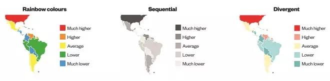
Figure 6: Using colour in a graph
Courtesy of Nigel Hawtin
Using rainbow colours makes the differences between the sections obvious but can make it more difficult to see a trend. Sequential colours demonstrate a pattern better, but comparisons can be difficult when similar colours are far away from one another. Divergent colours help to show a trend and clearly demonstrate differences between sections
It is sensible to start by using only one colour and tints to see if it will work. Black and greys are a good starting point.
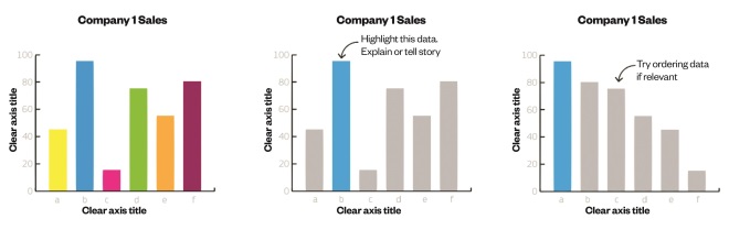
Figure 7: Deciding which colour to use
Courtesy of Nigel Hawtin
Black and white with a single colour tint can be a good place to start when choosing colours
Regardless of who the audience is, the visuals need to describe and explain what is going on without requiring large amounts of explanatory text. A succinct explanatory heading and subheading should be sufficient.
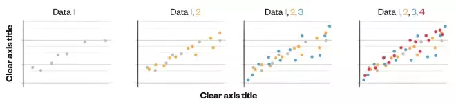
Figure 8: Building up the story
Courtesy of Nigel Hawtin
A series of graphs can help tell a story while still displaying single sets of data in a meaningful way
Tips for presenting data effectively in a poster or presentation
Know your audience
Before you think about designing your poster or presentation, you will need to know who you are intending to show it to. Understanding whether your audience will be fellow experts who understand the subject matter or a more general scientific audience is vital in helping them understand the content.
Define the message and conclusion
If you know and understand the story you are trying to tell, you have a great starting point and will find it easier to design the final poster or presentation. Guide the reader through the story in a linear, narrative fashion — slide by slide or graphic by graphic, with explanatory headers in a logical way on a poster.
Edit the data and use correct chart types and colours
Good visualisation starts with strong accurate data and a reason to show it. Make sure the data are formatted and understandable. Clean data are easier to organise and display.
Choosing the correct chart type is paramount to displaying the data effectively. The data may work with more than one chart type so make sure the one you use displays the message and data clearly and accurately. Always remember that the primary objective of any chart is to highlight and enhance comprehension and storytelling, providing clarity and insight to the data. Make sure the colours work across the presentation or poster.
Lead the viewer
Give your audience something to relate to — an arresting image, explanatory header, or colour that guides the eye through the poster or series of slides. Big bold headers and images draw our eyes first so create a narrative using concise, easily accessible headlines and explanatory text.
Make the design flow easily, ensuring you know where to look first and where to follow next. This applies to both the text and the visuals. Use clear, concise headers for all the individual charts with additional information included in explanatory sub-headers and annotations on the graph if necessary. However, the audience should not have to read through lines of subtext under the chart to be able to understand it in the first place.
Avoid unnecessary clutter
Visual clutter can be distracting. Make sure your story is prominent and easily accessible. Avoid heavy coloured images or big blocks of colour and text. Your research, story and graphics are the important things. Less is more is a useful mantra.
Trial it
Try showing the design or slides to someone who has not seen it before or does not know the subject matter. Does it make sense to them?
Understandable, concise, authoritative, accurate and visually stimulating images and graphics are an excellent way of communicating scientific findings. Therefore, it is vital that this important aspect of a poster or presentation is not left to the last minute or overlooked altogether.
Reading this article counts towards your CPD
You can use the following forms to record your learning and action points from this article from Pharmaceutical Journal Publications.
Your CPD module results are stored against your account here at The Pharmaceutical Journal. You must be registered and logged into the site to do this. To review your module results, go to the ‘My Account’ tab and then ‘My CPD’.
Any training, learning or development activities that you undertake for CPD can also be recorded as evidence as part of your RPS Faculty practice-based portfolio when preparing for Faculty membership. To start your RPS Faculty journey today, access the portfolio and tools at www.rpharms.com/Faculty
If your learning was planned in advance, please click:
If your learning was spontaneous, please click:
References
[1] Playfair W, Wainer H (ed.) & Spence I (ed.). The commercial and political atlas and statistical brevity. New York: Cambridge University Press; 2005.
[2] Potter MC, Wyble B, Hagmann CE et al. Detecting meaning in RSVP at 13 ms per picture. Atten Percept Psychophys 2014;76(2):270–279. doi: 10.3758/s13414-013-0605-z
[3] Anscombe F. Graphs in Statistical Analysis. Am Stat 1973;27(1):17–21. doi: 10.2307/2682899